Download the Level logo:

Logo Usage Guidelines
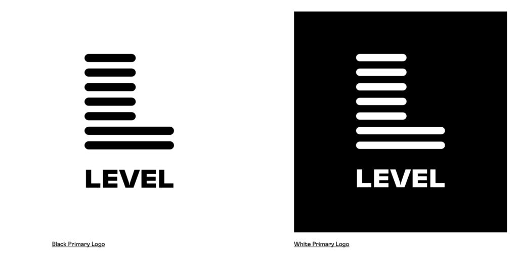
Primary Logo: Our primary logo is our preferred visual representation of our brand. The primary logo always consists of the L mnemonic and the word LEVEL beneath it (they should not be separated or arranged differently):
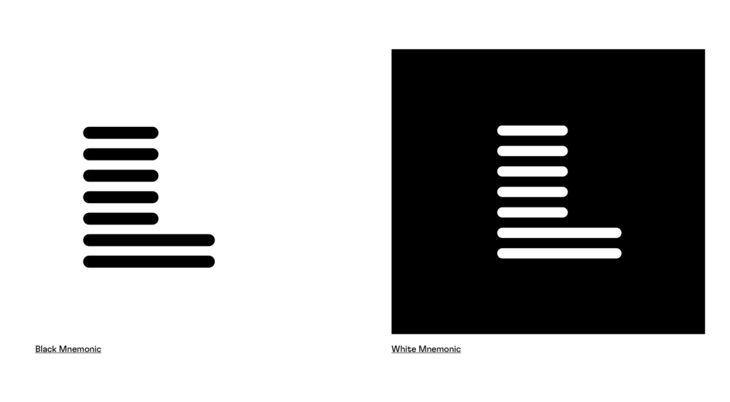
Mnemonic: The foundation of our visual system is our Mnemonic. An L made out of a series of lines. This mnemonic acts as an instant signifier of our brand and should be widely used to build equity. The mnemonic represents the platform—the space where success thrives and builds upon itself:
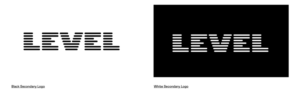
Secondary Logo: Our secondary logo offers an alternative when space allows. Use this logo to differentiate certain applications and make them stand apart. This is the preferred logo when you have a horizontal space:
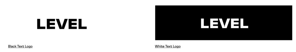
Text only logo: In special circumstances, we are able to use our text logo. This is for when we have very limited space or it needs to be used very small:
Color Palette
Our primary colors are made up of black, white and grey. They should be used in large fields when possible and provide the basis of our visual system.
Primary Colors
| WHITE | #FFFFFF | R:255 G:255 B:255 | |
| BLACK | #000000 | R:0 G:0 B:0 | |
| GRAY | #D9DEF0 | R:217 G:222 B:240 |
Secondary Colors
Our secondary colors are highlights. They are designed to be used in small fields. These colors should provide a vibrant personality and aid in calling attention to design elements. These colors are to be used sparingly, and we don’t recommend using them ALL at once (unless in animation, for specific instances.)
| BLUE | #86D5F4 | R: 134 G:213 B:244 | |
| PINK | #FD6EF8 | R: 253 G:110 B:248 | |
| GREEN | #8EE34D | R: 142 G:227 B:77 | |
| ORANGE | #FFAA53 | R: 255 G:170 B:83 |
Color Guidance
- The primary brand colors are Black and White. You’ll be tempted to use the secondary colors a bunch — but keep them as accents and highlights. They’ll have more impact that way.
- The secondary colors should NOT be used as font colors, or with white text on them. Especially for digital use: they do not pass contrast checks for accessibility.
Typography
Headline font: Our headline typeface is Inter Tight. Use this in its heavier weights for text headlines and when you want to make an impact with type. We recommend Inter Tight Black for headlines and Inter Tight Bold for subheads.
Body copy: To complement our headline typeface, we use DM Sans for our body font. This is a simple sans-serif typeface that works best at smaller sizes such as for use as body copy.
Headline and subhead capitalization: To complement our headline typeface, we use DM Sans for our body font. This is a simple sans-serif typeface that works best at smaller sizes such as for use as body copy.
Period usage: When a headline or subhead forms a complete sentence – one that contains a subject and a predicate – use a period at the end. If the headline or subhead doesn’t form a complete sentence, omit the period.
